


The Best Kept Secret in Investing
Where we are in the market cycle...

Before we get started, I want to welcome the 256 subscribers who signed up for the Let’s Analyze newsletter in the last week! If you want to join our community, make sure to sign up here:
Do you remember January 2021?
The stock market was hitting all-time highs every day. Bitcoin was trading at $60,000.
SPACs, high-growth stocks, and meme stocks were doubling and tripling in a matter of weeks.
Everyone was getting rich – and fast. It was a euphoric period in market history.
And in hindsight, it was clearly the top of the last market cycle.

You never know for sure where you are in the cycle, as the “peaks” and “troughs” are only apparent in hindsight
But the market does give us clues as to where we are in the market cycle.
So let’s dig into a few of them today.
Taking the Temperature of the Room
Investors who can estimate where they are in the market cycle have a huge advantage.
For instance, I posted this question to my 100,000 Instagram followers last week…
…and the vast majority said we were in the “fear” stage of the current cycle:

I imagine most of these votes were based on how people “feel” about their portfolios.
Considering 2022 was the worst year for the S&P 500 since the Global Financial Crisis in 2008…

…being “fearful” makes sense.
But for me, I prefer to use three indicators to gauge where we are in the cycle.
Indicator #1: The Federal Funds Rate (FFR)
When people say, “The Fed is raising rates” they mean the central bank is increasing something called the Federal Funds Rate (FFR).
Think of the economy as a burning fire. When the Fed raises the FFR, it’s akin to throwing water on that fire as higher interest rates make it less attractive to borrow and invest.

On the other hand, think of lowering the FFR as throwing gasoline on a fire.
Low interest rates stimulate the economy by making it cheaper for individuals and businesses to borrow money. This can lead to increased spending and investment, which can in turn boost economic growth and stock prices.
It follows that when the Fed begins lowering interest rates, we are at the early stages of a new “boom” in the market cycle.

And when the Fed begins raising interest rates – like they were nearly a year ago – we are near the “bust” of the market cycle.
The futures market is telling us the Fed is near the end of their hiking cycle.

That means according to this indicator, we’re much closer to the “trough” of the cycle than the “peak.”
Indicator #2: The Yield Curve
The US government is the safest and largest lender on Earth.
Just like companies’ issue bonds to fund their businesses, the US government issues treasury bonds to finance the government.

The US Treasury issues bonds for different lengths of time, ranging from three months to 30 years. Normally, investors demand higher yields for longer-term bonds. This makes sense, as it’s harder to predict economic changes or major world events 30 years out.
The longer the maturity, the higher—or steeper—the yield.

The chart above shows Treasury yields forming their usual, upward-sloping curve.
But when the yield curve inverts, the opposite dynamic plays out; investors begin demanding higher yields for shorter time horizons. This happens because investors are more nervous about the near-term (1-2 years) than the long-term (10-30 years).
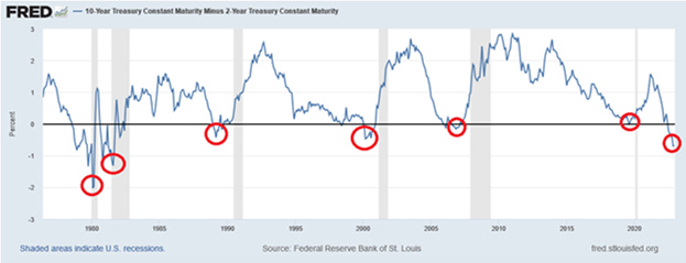
And this dynamic has played out before every recession and bear market since 1954:

An inverted yield curve doesn’t cause recessions; it’s a reliable leading indicator that we are near the top of the market cycle. And unfortunately, the yield curve is currently at its most inverted level in 40 years:

The yield curve inversion implies we’re closer to the “peak” of the market cycle.
Indicator #3: Investor Sentiment
The market cycle is affected by the emotions and sentiment of investors.
There are countless market sentiment indicators, but the one I watch closest is the CBOE Volatility Index (VIX). Also known as the “fear index,” the VIX tells you how investors are feeling about the market at any given time.
When the VIX is below 20, it corresponds to stable periods in the market. And when the VIX is above 30, it means investors are nervous.
But when the VIX “spikes” to 50 or higher, it’s a full-blown market panic:

Counterintuitively, “VIX spikes” are often the best time to buy stocks.
A few other investor sentiment indicators I watch are the put/call ratio, stock market breadth, and the “spread” between high-yield and investment grade bonds. That’s in addition to how many people are asking me if it’s time to “buy the dip” in my comments.
When people stop asking, that’s usually when I hit the buy button.
According to the VIX and other investor sentiment indicators, we’re closer to the “trough” of the market cycle.
Where We Are in The Market Cycle
Identifying where we are in the market cycle is not an exact science.
But we do know a few things:
The Federal Reserve is still raising interest rates but it likely near the end of their rate hike cycle
The yield curve is inverted; however it is starting to slope upwards
The VIX is below 20 and we have yet to see a VIX spike (but people are asking less frequently if it’s time to buy stocks)
For the stock market, I believe we are in the “panic” phase…

…meaning the S&P 500 likely has a little more downside before we hit bottom.
While that might sound scary to some of you, it means that we are over two-thirds of the way through the “bust” phase of this market cycle.
And after the bust comes yet another boom. Because the best kept secret in investing is that despite world wars, pandemics, and terrorist attacks, the US stock market moves in a somewhat predictable long-term pattern – up!

That means soon it will be time to begin buying stocks, crypto, and other assets on the cheap.
And if you want to know when I’ll be buying, make sure to subscribe to this newsletter.
Stay safe out there,
Robert
Excellent analysis! Where do you look for your VIX charts? Where are we with shorts vs longs at the moment? A lot of internet noise and hard to find trustworthy information!