


Five Charts Every Investor Needs to Know
These will save you thousands over your investing journey...

Before we get started, I want to welcome the +49 subscribers who signed up for the Let’s Analyze newsletter in the last week! If you want to join our community, make sure to sign up here:
There’s a lot of bad information out there.
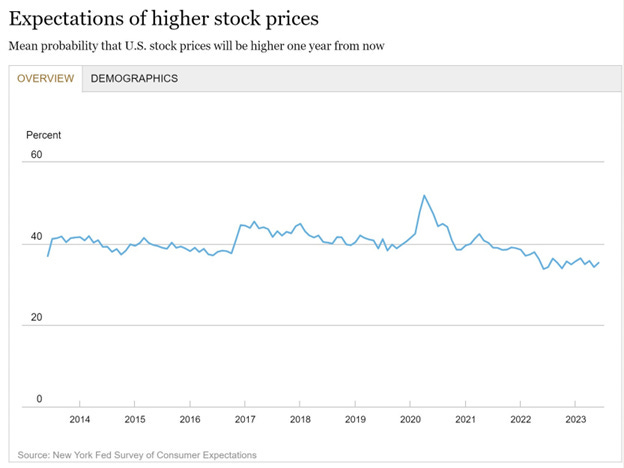
And that’s especially true in the investing space. For instance, if you ask the average American if they think “stocks will go up next year,” nearly half of respondents in any given year will say “no.”
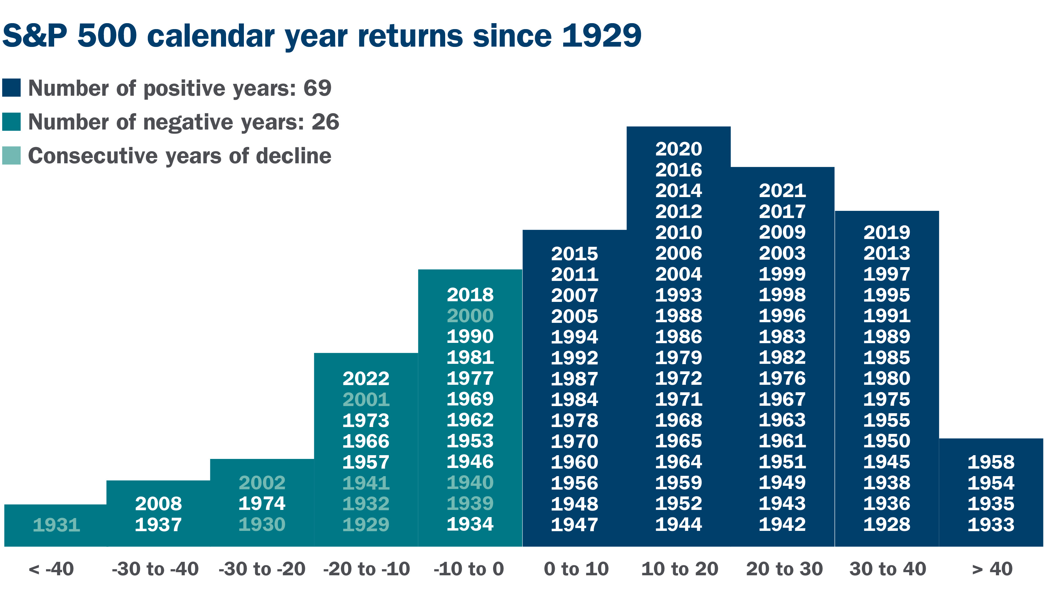
Which is funny, considering the S&P 500 finishes in positive territory year-over-year about 73% of the time:
I understand why people think this. In the age of social media, engagement is the currency of choice. People will say anything to get you to click on their post because there’s a monetary incentive to do so.
The more clicks they get, the more money they get. And unfortunately, the easiest way to get clicks is to be pessimistic.
Lucky for you, I am not dependent on “clicks” and can give it to you straight.
And that’s exactly what we’re going to do today.
Chart #1: There Are Always Reasons to Sell
You may have seen “perma bears” like this guy on your YouTube algorithm:
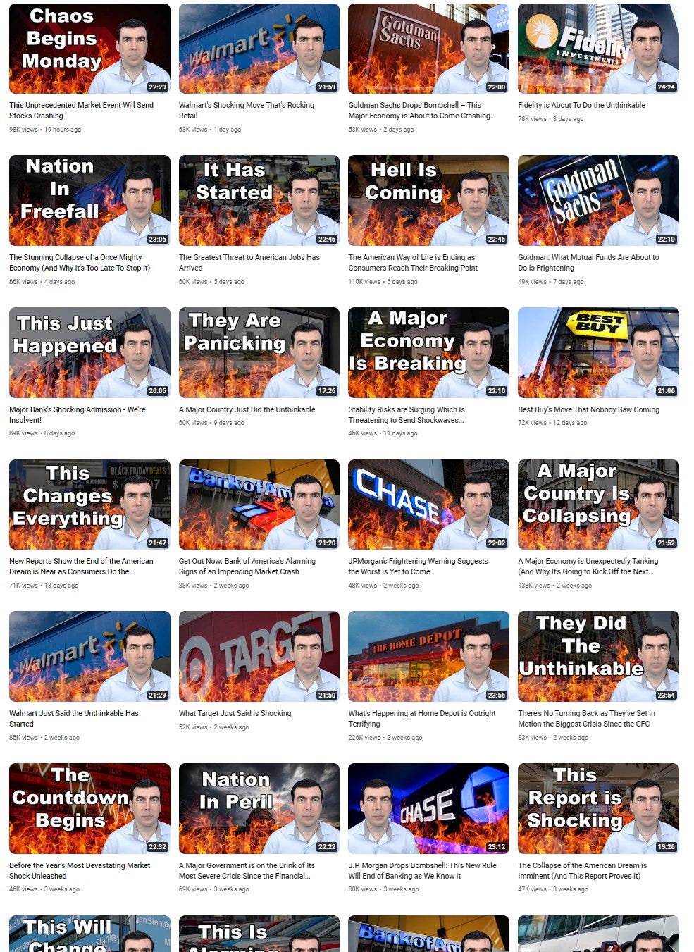
Creators like him always focus on the worst things happening in the markets. They want to make you worry, and likely buy physical gold (and, of course, buy their course).
But as Peter Lynch put it 40 years ago, markets tend to climb a “wall of worry.”

Lynch says investors constantly face a barrage of worrisome information. This includes economic downturns, geopolitical issues, or market volatility… like a looming recession, War in the Middle East, and hyperinflation.
Despite these worries, Lynch encourages investors to maintain a long-term perspective. By navigating through the "wall of worry" and staying focused on the fundamental strength of their investments, you can benefit from the overall growth of the market over time.
There will always be things to worry about. But selling your stocks when things look “bad” is the worst thing you can do.
Chart #2: It Pays to Be a Long-Term Bull
Everyone focuses too much on bear markets.
Yes, as we saw in 2022, bear markets do happen. And they are painful.
However, they are also rare and - historically - always buying opportunities.

Bear markets are also much shorter than bull markets. The average bull market lasts 991 days compared to 289 for bear markets. That means bull markets last nearly three-times longer than bear markets.
This alone makes it worthwhile to have a “bullish bias.”
Chart #3: Volatility is Normal
New investors often get nervous when stocks are volatile.
They incessantly check their portfolios, seeing how much its value has changed. And on red days, all they want to do is sell.
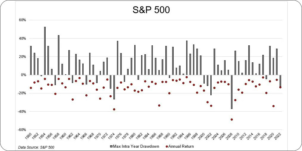
But that’s the worst thing you can do. As this chart shows, even during years when the stock market is up over 20%, we often have pullbacks of 20% or more:
Your goal should be to not get “shaken out” of your portfolio positions on red days.
Because when it comes to stocks, you are rewarded with higher returns because of this volatility.
Chart #4: Politics and Investing Don’t Mix
Everyone wants to work politics into every facet of life these days.
I see it on my own posts. If I make a post saying we’re not in recession (NEWSFLASH: we aren’t) I get called a “Biden supporter.” But if I make a post critical of the Biden Administration, I get called a “Trump supporter.”
These comments always make me laugh. My goal is to make money in the markets, not score political brownie points. And as this chart shows, who’s in office has little-to-nothing to do with stock market returns:
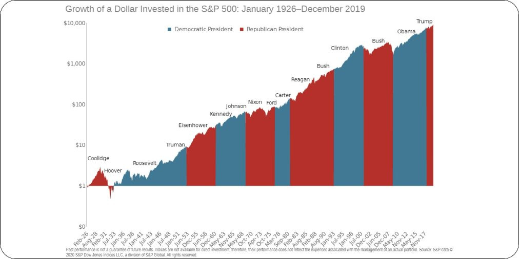
I always tell people to “tune out” the noise when it comes to politics. But if you’re an investor, it’s even more important to remain politically neutral as politics can cloud your thinking.
Chart #5: Time is Your Best Friend
When people start investing, they often want to be a “trader.”
They see movies like The Big Short or Wall Street and find the allure of putting on high-risk, directional bets appealing.
But in reality, that’s not how you make money. In fact, the odds of making money on your position goes up dramatically the longer you hold:
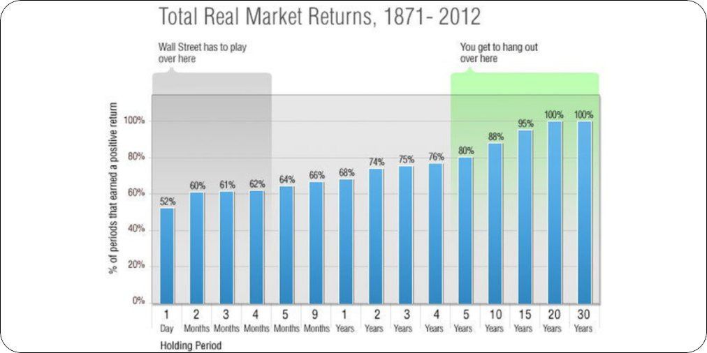
As this chart shows, the odds of your S&P 500 investment being in positive territory is 80% after five years. And after 20 years? It’s over 100%.
Trading in and out of positions may seem appealing. But if you’re looking to have math on your side, long-term investing is the way.
I know it can be tough navigating the markets. We are all inundated with a barrage of investing takes every year.
But if you keep these five charts in mind, it will help you avoid costly mistakes.
Stay safe out there,
Robert